Brand Identity
Softening Body Oil
Conceptualised as a luxurious, natural, and moisturizing product catering to consumers who sought deep hydration without the greasiness often associated with body oils.

Duration
6 months from concept to market launch
Role
Lead Brand Designer
Team
Collaborated with a team of 8
Key tools
Adobe Creative Suite, Trello for project management, and Slack for team communication
Objective


Packaging
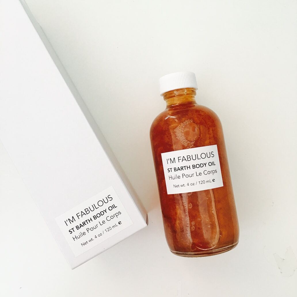
Bottle & Label
Frosted glass with a gold dropper cap, to exude a feeling of luxury while allowing the consumer to see the clarity of the oil.
Soft beige with gold lettering accompanied by a small, deep green leaf symbol to accentuate the natural elements.

Identity
How do we visually create this?
A minimalist droplet with a soft curve to symbolize the gentle hydration. The droplet is gold, signifying luxury.
Gold: Luxury and richness
Soft beige: Natural and understated elegance
Deep green: Organic and fresh
A combination of a serif font for the brand name to impart elegance and a sans-serif for product details, ensuring readability.